
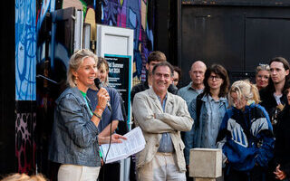

In het digitale tijdperk weet de ouderwetse langspeelplaat of vinylplaat (ook wel lp of elpeeplaat genoemd) zich wonderbaarlijk te handhaven. De plaatverkoop stijgt jaar na jaar, en het kopen van platen is voor velen nog altijd een geliefd ritueel. Op dit moment is er in Gallery WM in Amsterdam de tentoonstelling ‘Echoes on Vinyl’ tezien, samengesteld door Krzysztof Bogdański.
Ik sprak met Krzysztof en bekeek met hem de diverse prachtige grafische plaatontwerpen.

DJ
Het begon allemaal tien jaar geleden, per ongeluk, vertelt hij. “Ik had contact met een oude vriend. Hij wilde mij leren hoe ik kon dj‘en, hoe ik het vak van DJ kon uitoefenen, en dan vooral de techniek.”
Een DJ selecteert en mixt muziek voor een publiek, bijvoorbeeld op radio, in clubs of op feesten. Letterlijk betekent het ‘schijvenrijder’, verwijzend naar de vroegere manier van draaien met vinylplaten. Tegenwoordig gebruiken DJ’s vaker computers, maar de functie is hetzelfde: de sfeer bepalen en mensen entertainen met muziek.
Krzysztof wilde vooral optreden bij feesten en evenementen “Een vriend van mij liet me zien hoe ik moest beatmatchen, hoe ik twee platen moest mixen, het kostte me letterlijk één dag om het in de vingers te hebben. De volgende dag draaide ik al een beetje platen.”
“Om te kunnen dj’en had ik twee draaitafels, een mixer, een koptelefoon en natuurlijk platen nodig . Toen ik apparatuur kocht, had ik twee Reloop-draaitafels, een Behringer-mixer en een Behringer-koptelefoon. Een vrij eenvoudige set-up voor beginners.
Platen kocht ik destijds inderdaad bij Zwart Goud, maar niet alleen daar. Ook bij Distortion Records, Rush Hour, Clone Records Rotterdam en andere platenzaken.”

Platen verzamelen
Al eerder, in de periode 2002-2004, had hij ook al wat platen met elektronische muziek aangeschaft in Amsterdam. Na twee / drie jaar, rond 2006, stopte hij voor een poosje met verzamelen. Hij ging aan de slag, DJ’en bij feestjes, maar had niet de behoefte een bekende DJ te worden. “Het was voor mij meer een hobby.”
In 2015 ging hij verder met het uitbreiden van zijn platenverzameling. “Een plaat kost minimaal 10 euro. Als DJ heb je 100 – 200 platen nodig, dat is het minimum als je wil beginnen. Op Marktplaats vond ik mensen die tweedehands platen verkochten. Van een persoon kocht ik 200 platen. Toen had ik een goede beginvoorraad, die ik ging uitbreiden. Ik bezocht muziekwinkels in Amsterdam als Concerto, Rush Hour, Zwart Goud en Distortion. Ik ging ook naar Rotterdam, naar Clone Records, deze zaak speelt een grote rol op de markt voor elektronische muziek in Europa. Ook bestelde ik online, in Nederland, België en in Duitsland. Toen had ik 700 platen. Het was niet alleen techno, maar ook metal, reggae, oude disco , funk en soul.”

De hoezen
Krzysztof had altijd al aandacht voor de hoes gehad, maar het belangrijkste was toch de content, de muziek. “Ik koop nooit platen alleen voor de hoes. Als de hoes goed is, wil ik weten welke designer het gemaakt heeft. Als iemand jarig is, geef ik bijvoorbeeld graag een fles likeur in een mooie doosje met hartjespapier verpakt. Dat geeft het cadeau iets extra’s. Zo zie ik ook de hoes. Als ik cadeau wil geven, geef ik iets met een mooie verpakking; als ik het krijg, maakt een presentje dat origineel is ingepakt me gelukkig. Ik voel dan dat de gever echt om me geeft.”
Het viel hem op dat er zo veel mensen betrokken zijn bij een grafisch design. “Ik zie hoeveel zorg er is gegeven om de plaat mooi te maken. Sommige hoesontwerpen zijn echte kunstwerken. Vaak is het teamwerk.”
In deze tentoonstelling wil hij meer aandacht geven aan de mensen achter het grafisch ontwerp. “Ze spelen een belangrijke rol in het productieproces, maar hun werk wordt onderschat. Daarom wil ik ze meer in het licht zetten. Het is een verscheidenheid aan mensen. Soms zijn het jonge mensen die voor weinig geld voor een tijdje in dienst zijn genomen van een productiemaatschappij, soms is het de producer zelf die ’s nachts aan de slag gaat, en dan zijn er de gevestigde namen als Yusuf Etiman, Jean-Baptiste Mondino, en Jazz Szu-Yin Chen. “

Wat is zijn artistieke filosofie?
Krzysztof: “Ik ben niet elke dag professioneel met kunst bezig. Ik doe het op bepaalde tijden. Kunst is voor mij een kans om mezelf te uiten, mijn emoties te tonen, en te verwerken in een iets wat we kunst zouden kunnen noemen. Dat doe ik met mensen die min of meer hetzelfde gevoel delen, zodat het in principe aan iedereen wordt getoond. De reacties zijn belangrijk. Hoe zien de anderen het, welke betekenis kennen zij eraan toe? Daarbij is het belangrijk dat ik in wat ik ook doe mezelf blijf.”
“Spelen en DJ ‘en is voor mij ook een vorm van meditatie. Ik speelde in bands, gitaar. Als ik dat doe, vergeet ik alles. Soms weet ik niet meer hoe lang ik heb gespeeld. Ik heb boeddhistische meditatie geprobeerd, dat werkte nooit. Maar na twee / drie uur achter mijn draaitafels is mijn geest schoon, het geeft me een opgeruimd gevoel.”
“Ik speel liever niet voor 5000 mensen die het niet kan schelen wat er gedraaid wordt, en wel voor 10 mensen die geïnteresseerd zijn in de muziek.”
De keuze van Krzysztof uit de hoezen
We lopen langs de hoezen. Krzysztof kiest als illustratie bij dit artikel de volgende negen grafische ontwerpen:
1. Ribe – Palette
The cover, a volatile abstract composition of harsh white aggressively cutting through deep blues and black, visually captures a clash of sonic forces. This imagery is the work of Acid Hazel (Patricia Hazel), a Berlin-based creative renowned for designing over 100 vinyl records in the electronic scene. Her high-contrast, expressive brushstrokes perfectly reflect the momentum of raw energetic techno or industrial noise, where elements collide to generate pure rhythmic power.
2. Kontain
This cover embodies aggressive sensuality and shadow play, a visual equivalent to Kontain’s dark , industrial electronic sound. The striking, grainy monochrome photograph of a tightly cropped torso , possibly by a dedicated label designer, uses high contrast and deep shadows to convey a raw, uncompromising mood. A hint of metallic gleam from jewelry adds a hard edge. The vertically oriented title, K O N T A I N, is rendered in stark white, acting as a rigid, digital pillar against the organic, tactile curves of a human form.
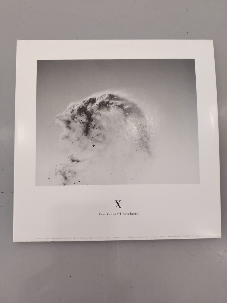
3. Ten Years of Artifacts
The cover is a masterful piece of photographic minimalism, instantly recognizable as the work of Ignazio Mortellarro. The central monochrome image captures a dramatic, fleeting moment of disintegration – a cloud of dusk or ash exploding into the void. This stark visual perfectly embodies the Stroboscopic Artefects label’s aesthetic: a fusion of cerebral and physical techno. Mortellaro’s design beautifully translates the music’s complex textures and themes of entropy and time into a concise symbol, celebrating a decade of influential , forward-thinking electronic sound.
4. The Industrial Aesthetic
This trio of covers defines a raw, uncompromising industrial aesthetic, reflecting music that is deliberately severe and unpolished. The visuals consistently utilize stark black-and-white contrast to convey themes of rebellion and confinement. One cover features barbed wire and chain-link fencing (Zeks in Revolt), while others use aggressive splatters and abstract textures, channeling Abstract Expressionism’s energy with an industrial coldness. The simple typography and bold use of reverse imagery (Wage Slave) reinforce the anti-commercial, activist mood, visually capturing the powerful, cyclical and abrasive nature of the sound.
5. Jean-Baptiste Mondino
Jean-Baptiste Mondino is a master of visual storytelling whose versatile talent connects the worlds of music, photography, and fashion. He is the author of this iconic, black-and-white portrait of Björk, which served as the cover for her groundbreaking debut album , “Debut”(1993).
Mondino is celebrated for collaborating with megastars – he directed legendary music videos for Madonna, David Bowie, and Sting, and his photographs have graced album covers for artists like Prince. His unique style, which blends theatricality with raw beauty, has also made him a revered fashion photographer, working with brands like Dior and Chanel.

6. Moby : Everything Is Wrong
The cover, likely shot by Mary Ellen Mark, plunges the viewer into a hyper-saturated, unsettling underwater portrait. Moby’s face, bathed in jarring cyan light against a fiery orange background, evokes a sense of drowning or disorientation, perfectly mirroring the album’s title and its eclectic mix of techno, punk and introspective electronica. The bold, contrasting typography anchors the chaos.
7. Marcell Dettmann – Test – File
The cover art for Marcel Dettmann’s release is a texture piece of distressed abstraction, perfectly complementing the artist’s dark, gritty, and emotional techno sound. The subtle, spray-painted textures in faded pink, black, and white over what appears to be crumpled paper create a palpable sense of decay and industrial atmosphere. The layout, credited to Yusuf Etiman, subtly places the artist’s name vertically, underscoring the serious uncompromising aesthetic. This collaboration visually grounds Dettmann’s work within the canon of Ostgut Ton, one of the most vital and influential labels in the global techno scene.
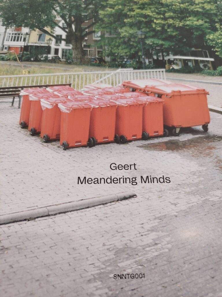
8. Geert – Meandering Minds
The cover is a literal yet conceptual visualization of the title. Local, niche artist Geert (Dub Techno) used a photograph by Natasja Martens depicting a cluster of orange trash containers lined up in an urban square.
The brightly colored bins create a striking contrast against the peaceful, green backdrop. The design by studiokem is minimalist, concisely linking the image to the title (Meandering Minds). This serves as a conceptual statement about order in chaos and the repetitiveness of urban cycles, perfectly matching the hypnotic, flowing nature of the Dub Techno music.
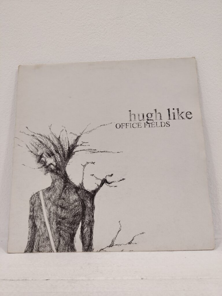
9. Hugh Like – Office Fields
This striking cover, almost certainly illustrated by Hugh Leik himself, is a poignant visual metaphor for alienation. The finely detailed pen-and-ink drawing depicts a withered , stressed figure whose head and arms dissolve into thorny, dead branches. This powerful image captures a mood of psychological decomposition and burnout. The stark white background and simple typography perfectly underscore the pervasive anxiety and emotional tension inherent in the album’s title and its likely introspective or melancholic electronic music.

Afbeeldingen: 1) portretfoto Krzysztof Bogdański, 2) Moby, 3) Geert Meandering Minds, 4) Ribe — Palette, 5) Marcel Dettmann, 6) Ten Years of Artefacts, 7) Zeks in Revolt, 8) Hugh Like, 9) Jean-Baptiste Mondino, 10) KONTAIN


1 Pingback