


In the digital age, the old-fashioned LP (also known as vinyl record) has endured remarkably. Record sales are rising year after year, and buying records remains a cherished ritual for many. Gallery WM in Amsterdam recently hosted the exhibition “Echoes on Vinyl,” curated by Krzysztof Bogdański.
I spoke with Krzysztof and looked at the various beautiful graphic plate designs with him.
DJ
It all started ten years ago, by accident, he says. “I was in touch with an old friend. He wanted to teach me how to DJ, how to do DJing, and especially the technical side of things.”
A DJ selects and mixes music for an audience, for example, on the radio, in clubs, or at parties. It literally means ‘disc driver’, a reference to the old way of spinning vinyl records. These days, DJs more often use computers, but the function remains the same: setting the mood and entertaining people with music.

Krzysztof’s main goal was to perform at parties and events. “A friend of mine showed me how to beatmatch, how to mix two records. It literally took me a day to get the hang of it. The next day I was already spinning some records.”
“To DJ, I needed two turntables, a mixer, headphones, and of course, records. When I bought the gear, I had two Reloop turntables, a Behringer mixer, and Behringer headphones. A pretty basic setup for beginners.
I did buy records at Zwart Goud back then, but not just there. I also bought them at Distortion Records, Rush Hour, Clone Records Rotterdam, and other record stores.”

Record Collecting
Earlier, between 2002 and 2004, he had also acquired some electronic music records in Amsterdam. After two or three years, around 2006, he stopped collecting for a while. He started working, DJing at parties, but had no desire to become a famous DJ. “It was more of a hobby for me.”
In 2015, he continued expanding his record collection. “A record costs at least 10 euros. As a DJ, you need 100-200 records; that’s the minimum to start. I found people selling secondhand records on Marktplaats. I bought 200 records from one person. That gave me a good starting stock, which I started expanding. I visited music stores in Amsterdam like Concerto, Rush Hour, Zwart Goud, and Distortion. I also went to Rotterdam, to Clone Records; this store plays a major role in the European electronic music market. I also ordered online, in the Netherlands, Belgium, and Germany. By then, I had 700 records. It wasn’t just techno, but also metal, reggae, old disco, funk, and soul.”

The covers
Krzysztof had always paid attention to the cover, but the most important thing was the content, the music. “I never buy records just for the cover. If the cover is good, I want to know which designer created it. For example, on someone’s birthday, I like to give a bottle of liqueur in a nice box wrapped in hearts paper. That gives the gift something extra. That’s how I see the cover. If I want to give a gift, I give something with beautiful packaging; when I receive it, an original gift wrap makes me happy. Then I feel that the giver truly cares about me.”
He was struck by how many people are involved in graphic design. “I see how much care goes into making the record beautiful. Some cover designs are true works of art. It’s often a team effort.”
In this exhibition, he wanted to give more attention to the people behind the graphic design. “They play an important role in the production process, but their work is underestimated. That’s why I want to put them in the spotlight. It’s a diverse group of people. Sometimes they’re young people hired by a production company for a short period for little pay; sometimes it’s the producer himself who works at night; and then there are established names like Yusuf Etiman, Jean-Baptiste Mondino, and Jazz Szu-Yin Chen.”

What is his artistic philosophy?
Krzysztof: “I don’t work professionally with art every day. I do it at certain times. For me, art is an opportunity to express myself, to show my emotions, and to process them into something we could call art. I do this with people who more or less share the same feelings, so that it is, in principle, shown to everyone. The reactions are important. How do others see it, what meaning do they attach to it? It’s important that I remain myself in whatever I do.”
“Playing and DJing is also a form of meditation for me. I used to play in bands, guitar. When I do that, I forget everything. Sometimes I forget how long I’ve been playing. I tried Buddhist meditation, but it never worked. But after two or three hours behind the decks, my mind is clear; it gives me a clean feeling.”
“I’d rather play for 10 people who are interested in the music than for 5,000 people who don’t care what’s being played.”

Krzysztof’s selection from the covers
We’ll take a look at the covers. Krzysztof has chosen the following nine graphic designs to illustrate this article:
1. Ribe – Palette
The cover, a volatile abstract composition of harsh white aggressively cutting through deep blues and black, visually captures a clash of sonic forces. This imagery is the work of Acid Hazel (Patricia Hazel), a Berlin-based creative renowned for designing over 100 vinyl records in the electronic scene. Her high-contrast, expressive brushstrokes perfectly reflect the momentum of raw energetic techno or industrial noise, where elements collide to generate pure rhythmic power.
2. Kontain
This cover embodies aggressive sensuality and shadow play, a visual equivalent to Kontain’s dark , industrial electronic sound. The striking, grainy monochrome photograph of a tightly cropped torso , possibly by a dedicated label designer, uses high contrast and deep shadows to convey a raw, uncompromising mood. A hint of metallic gleam from jewelry adds a hard edge. The vertically oriented title, K O N T A I N, is rendered in stark white, acting as a rigid, digital pillar against the organic, tactile curves of a human form.
3. Ten Years of Artifacts
The cover is a masterful piece of photographic minimalism, instantly recognizable as the work of Ignazio Mortellarro. The central monochrome image captures a dramatic, fleeting moment of disintegration – a cloud of dusk or ash exploding into the void. This stark visual perfectly embodies the Stroboscopic Artefects label’s aesthetic: a fusion of cerebral and physical techno. Mortellaro’s design beautifully translates the music’s complex textures and themes of entropy and time into a concise symbol, celebrating a decade of influential , forward-thinking electronic sound.
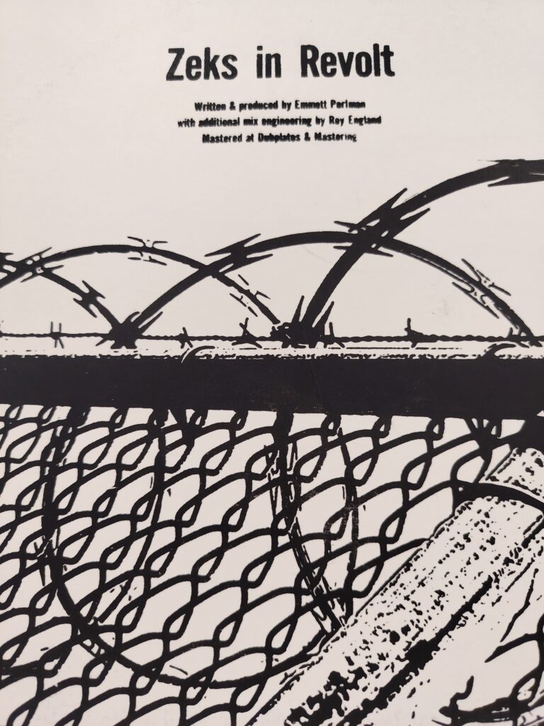
4. The Industrial Aesthetic
This trio of covers defines a raw, uncompromising industrial aesthetic, reflecting music that is deliberately severe and unpolished. The visuals consistently utilize stark black-and-white contrast to convey themes of rebellion and confinement. One cover features barbed wire and chain-link fencing (Zeks in Revolt), while others use aggressive splatters and abstract textures, channeling Abstract Expressionism’s energy with an industrial coldness. The simple typography and bold use of reverse imagery (Wage Slave) reinforce the anti-commercial, activist mood, visually capturing the powerful, cyclical and abrasive nature of the sound.

5. Jean-Baptiste Mondino
Jean-Baptiste Mondino is a master of visual storytelling whose versatile talent connects the worlds of music, photography, and fashion. He is the author of this iconic, black-and-white portrait of Björk, which served as the cover for her groundbreaking debut album , “Debut”(1993).
Mondino is celebrated for collaborating with megastars – he directed legendary music videos for Madonna, David Bowie, and Sting, and his photographs have graced album covers for artists like Prince. His unique style, which blends theatricality with raw beauty, has also made him a revered fashion photographer, working with brands like Dior and Chanel.
6. Moby : Everything Is Wrong
The cover, likely shot by Mary Ellen Mark, plunges the viewer into a hyper-saturated, unsettling underwater portrait. Moby’s face, bathed in jarring cyan light against a fiery orange background, evokes a sense of drowning or disorientation, perfectly mirroring the album’s title and its eclectic mix of techno, punk and introspective electronica. The bold, contrasting typography anchors the chaos.
7. Marcell Dettmann – Test – File
The cover art for Marcel Dettmann’s release is a texture piece of distressed abstraction, perfectly complementing the artist’s dark, gritty, and emotional techno sound. The subtle, spray-painted textures in faded pink, black, and white over what appears to be crumpled paper create a palpable sense of decay and industrial atmosphere. The layout, credited to Yusuf Etiman, subtly places the artist’s name vertically, underscoring the serious uncompromising aesthetic. This collaboration visually grounds Dettmann’s work within the canon of Ostgut Ton, one of the most vital and influential labels in the global techno scene.
8. Geert – Meandering Minds
The cover is a literal yet conceptual visualization of the title. Local, niche artist Geert (Dub Techno) used a photograph by Natasja Martens depicting a cluster of orange trash containers lined up in an urban square.
The brightly colored bins create a striking contrast against the peaceful, green backdrop. The design by studiokem is minimalist, concisely linking the image to the title (Meandering Minds). This serves as a conceptual statement about order in chaos and the repetitiveness of urban cycles, perfectly matching the hypnotic, flowing nature of the Dub Techno music.

9. Hugh Like – Office Fields
This striking cover, almost certainly illustrated by Hugh Leik himself, is a poignant visual metaphor for alienation. The finely detailed pen-and-ink drawing depicts a withered , stressed figure whose head and arms dissolve into thorny, dead branches. This powerful image captures a mood of psychological decomposition and burnout. The stark white background and simple typography perfectly underscore the pervasive anxiety and emotional tension inherent in the album’s title and its likely introspective or melancholic electronic music.

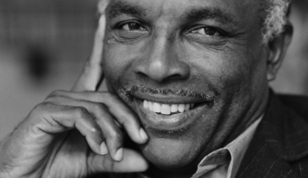
Images: 1) portrait photo Krzysztof Bogdański, 2) Moby, 3) Geert Meandering Minds, 4) Ribe — Palette, 5) Marcel Dettmann, 6) Ten Years of Artefacts, 7) Zeks in Revolt, 8) Hugh Like, 9) Jean-Baptiste Mondino, 10) KONTAIN
https://gallerywm.com/WP/ade-echoes-on-vinyl-23-10-15-11-2025/
https://inzaken.eu/index.php/2025/11/20/krzysztof-bogdanski-gefacineerd-door-de-platenhoes/


Leave a Reply